The best colors for website design can significantly impact user experience, influencing perceptions, emotions, and actions.
Understanding how colors on the web affect visitors can help designers create more engaging, effective sites.


Color psychology plays a pivotal role in website design.
It’s the study of how colors influence human behavior and emotion.
When visitors land on a website, the colors they see can immediately evoke certain feelings or associations.
This emotional response can affect their likelihood of performing certain actions, like making a purchase or subscribing to a newsletter.
Therefore, choosing the best colors for your website is not just about aesthetics; it’s about creating a psychological environment that aligns with your website’s goals.
10 Color Palettes Featuring the Best Colors for Website Design

1. Classic Blue and White
This palette combines classic blue’s trustworthiness and serenity with white’s purity and simplicity.
Ideal for corporate or informational websites, this combination suggests reliability and professionalism.
Hex Codes: Classic Blue: #007BFF – White: #FFFFFF

2. Energetic Orange and Grey
Orange, known for its energetic and creative vibes, paired with the neutrality of grey, creates a balance between enthusiasm and sophistication.
This palette works well for innovative startups or creative agencies.
Hex Codes: Energetic Orange: #FFA500 – Grey: #808080

3. Eco-Friendly Greens
Shades of green resonate with nature, health, and tranquility.
A palette of earthy greens can create a calming and eco-friendly atmosphere, perfect for wellness brands or environmental initiatives.
Hex Codes: Earth Green: #556B2F – Moss Green: #8FBC8F – Sage Green: #BDB76B

4. Warm Reds and Cool Greys
The warmth and excitement of red, balanced with cool, understated greys, can evoke a sense of passion tempered with professionalism.
This palette is excellent for brands looking and it is one of the nice Colors for Website Design to convey excitement and authority.
Hex Codes: Warm Red: #FF0000 – Cool Grey: #95A5A6
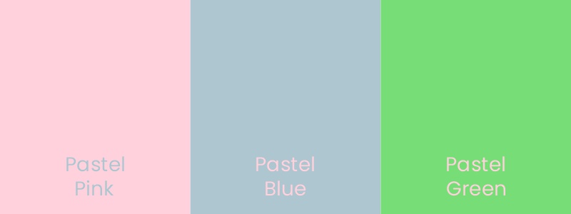
5. Pastel Paradise
Soft pastel hues offer a modern, friendly, and approachable look.
They’re particularly effective for lifestyle blogs, e-commerce sites selling baby products, or any site aiming for a gentle, welcoming feel.
Hex Codes: Pastel Pink: #FFD1DC – Pastel Blue: #AEC6CF – Pastel Green: #77DD77

6. Bold Black and Gold
For luxury brands or high-end services, a palette of black and gold suggests sophistication, elegance, and value.
This timeless combination can help create a perception of exclusivity and premium quality.
Hex Codes: Bold Black: #000000 – Gold: #FFD700
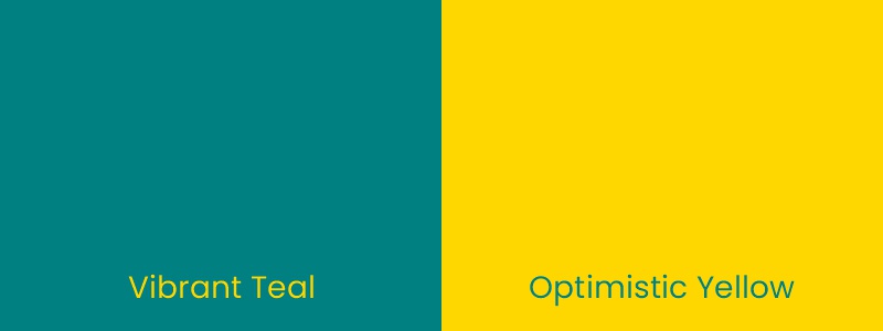
7. Vibrant Teals and Yellows
The refreshing and invigorating nature of teal, combined with the optimistic brightness of yellow, can stimulate energy and creativity.
This palette is ideal for innovative tech companies or educational platforms.
Hex Codes: Vibrant Teal: #008080 – Optimistic Yellow: #FFD700
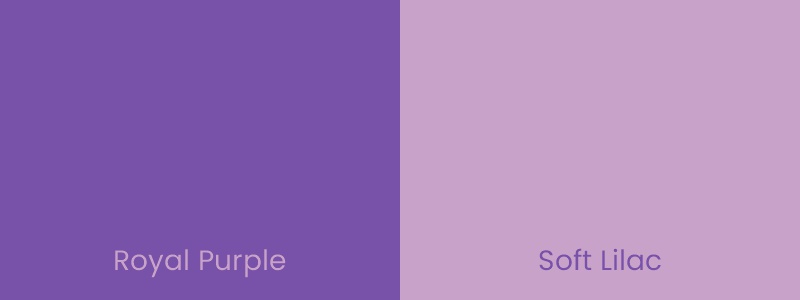
8. Royal Purple and Soft Lilac
Purple, associated with creativity, luxury, and wisdom, paired with the innocence of lilac, offers a deep, rich backdrop that is both imaginative and insightful.
This combination is suitable for artistic sites or those offering premium services.
Hex Codes: Royal Purple: #7851A9 – Soft Lilac: #C8A2C8
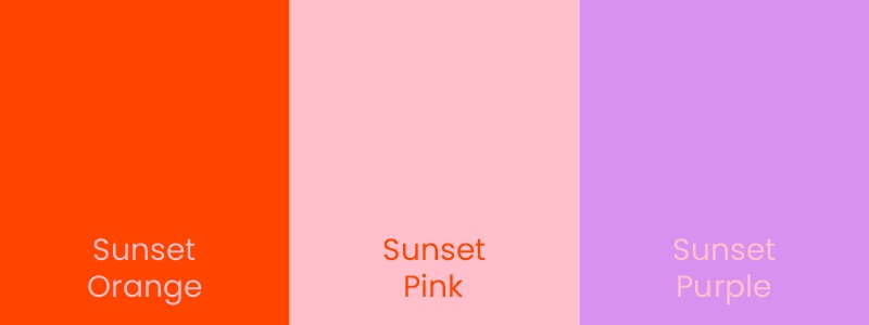
9. Sunset Hues
A palette inspired by the sunset, with warm oranges, pinks, and purples, can evoke feelings of warmth, happiness, and peace.
It’s perfect for travel blogs, wellness sites, or any platform aiming to inspire joy and contentment.
Hex Codes: Sunset Orange: #FF4500 – Sunset Pink: #FFC0CB – Sunset Purple: #D891EF

10. Minimalist Monochrome
A monochrome palette, using shades of a single color, creates a clean, minimalist look that’s versatile and modern.
It’s particularly effective for portfolios, blogs, and e-commerce sites focusing on design simplicity.
Hex Codes: Light Grey: #D3D3D3 – Medium Grey: #A9A9A9 – Dark Grey: #696969
Incorporating Colors on the Web Wisely

Choosing the best colors for your website involves more than just personal preference.
It requires understanding colour psychology, your brand’s identity, and the emotions you wish to evoke in your audience.
When implementing colors on the web, consider contrast for readability, cultural color associations, and accessibility to ensure your site is welcoming to all visitors.
By thoughtfully applying the principles of color psychology and selecting from these ten color palettes, you can enhance user engagement, convey your brand’s message, and achieve your website’s objectives more effectively.
Remember, the best colors for a website align with your goals, resonate with your audience, and bring your digital space to life.
What is Color Theory?

Color theory is an essential pillar in the world of design, providing a fundamental guide to the relationship between colors and their psychological impacts.
At its core, color theory examines how different colors interact with each other and how they influence the viewer’s perception and emotions.
It’s not just about choosing appealing combinations; it’s about creating a coherent visual experience that enhances the message and functionality of the design.
The principles of color theory apply to all visual mediums, from fine art to digital design, and encompass a wide range of concepts including color harmony, contrast, and balance.
By mastering these principles, designers can evoke specific responses, direct viewers’ attention to key elements, and maintain a cohesive aesthetic that aligns with the brand’s identity and goals.
The Color Wheel
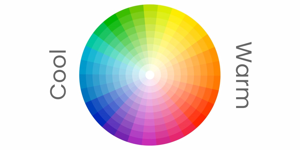
What is Color Wheel?
The color wheel is a circular diagram that illustrates the relationships between different colors.
It serves as a visual representation of color theory, helping designers and artists to understand how colors interact with each other.
The wheel is divided into primary colors (red, yellow, and blue), secondary colors (orange, green, and violet), which are created by mixing primary colors, and tertiary colors, which are formed by mixing primary and secondary colors.
This tool is invaluable for creating color schemes that work harmoniously together.
The Color Wheel in Design
In design, the color wheel is used to develop color schemes that can convey a mood, create a visual interest, or evoke a certain response.
These schemes include monochromatic (variations of a single color), analogous (colors next to each other on the wheel), complementary (colors opposite each other on the wheel), and triadic (three colors evenly spaced around the wheel).
Each scheme has its own set of rules and effects, allowing designers to choose the most appropriate palette for their project’s needs.
By strategically selecting colors based on their position on the color wheel, designers can achieve balance and harmony in their work, ensuring that the final product is both aesthetically pleasing and effectively communicates its intended message.
Frequently Asked Questions
The best color for a website depends on the site’s purpose, target audience, and brand identity.
Generally, blue is widely regarded as a safe and appealing choice for its professionalism and trustworthiness.
However, the optimal choice varies based on the emotional impact and action you want to evoke from your visitors.
The 3-color rule for websites suggests using a palette of three main colors to create harmony and balance in design.
Typically, this includes a dominant color for the background, a secondary color for headers and highlights, and a third accent color for calls to action and important features.
Bright and warm colors like red, orange, and yellow tend to attract attention due to their visibility and energy.
However, the attractiveness of a color also depends on its context and how it’s used within the design to appeal to the website’s target demographic.
The best color contrast for a website is a high contrast between background and text, ensuring readability and accessibility.
Black text on a white background is the most readable, but other high-contrast combinations, like dark blue on light gray, are also effective.
Three colors that go well together are often a combination of analogous and complementary colors, such as blue, green, and orange.
This palette offers both harmony and contrast, creating a visually appealing and balanced design.
Blue and yellow are two colors that complement each other well, offering a striking contrast that is both eye-catching and aesthetically pleasing.
This combination works well for a variety of designs and purposes.
Bright and pure colors like red or yellow are particularly eye-catching because they stand out well against other colors.
These are great for drawing attention to calls to action or important information.
One of the prettiest color combinations is pink and soft green, evoking a fresh, spring-like feel that’s pleasing to the eye.
This combo can create a soft, inviting, and harmonious design suited for various themes and purposes.
Bright green and bright red are two colors that often clash when used together, as they can create a jarring, visually unappealing contrast, especially in their most saturated forms.
The 60-30-10 rule is a classic design principle that suggests using 60% of a dominant color, 30% of a secondary color, and 10% of an accent color in your design.
This rule helps create a balanced and appealing color scheme.
The 80-20 rule, or Pareto Principle, in web design suggests that 80% of the effects come from 20% of the causes.
Applied to web design, this could mean that 20% of the design elements (such as key colors, calls to action, or content) will achieve 80% of the site’s objectives, like engaging users or driving conversions.
This rule emphasizes focusing on the elements that will have the most significant impact on your goals.
Order WordPress Website Design
At Maple Web Design, we specialize in creating stunning and functional WordPress websites that captivate audiences and drive results.