A company’s “Contact Us” page is more than just a functional necessity; it’s a critical touchpoint in the customer journey, setting the tone for the user experience.
The best Contact Us page examples go beyond mere utility, transforming a simple formality into an engaging, informative, and reassuring part of the website.
These pages stand as testaments to a brand’s commitment to customer service, showcasing creativity, accessibility, and attentiveness.
By exploring the top Contact Us page examples from leading companies like Apple, Adobe, and Shopify, we gain insights into how these digital giants leverage design, personalization, and user-friendly features to build trust and foster lasting relationships with their audience.

Each example offers a unique take on how to effectively communicate with visitors, ensuring their questions, concerns, and feedback are addressed as efficiently and pleasantly as possible.
As we delve into the specifics of each example, it becomes clear that the best Contact Us page examples share common traits: clarity, convenience, and a touch of brand personality.
These pages are meticulously designed to remove any barriers between the customer and the company, offering various contact methods such as forms, live chats, and direct links to social media profiles.
They also provide quick access to FAQs, operating hours, and even personalized greetings for a more welcoming user experience.
By examining these standout Contact Us page examples, businesses of all sizes can draw inspiration to elevate their customer service approach, ensuring that every visitor leaves with a positive impression.
Top Contact Us Page Examples
1. Apple
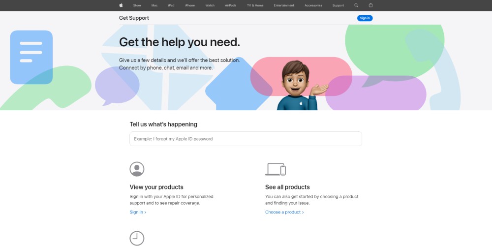
prioritizes customization in its support approach, tailoring assistance to the specific products and devices customers use.
Its “Contact Us” page is minimalist yet functional, encouraging users to sign in to receive more personalized support.
Once logged in, customers are greeted with an intuitive selection of topics and categories, plus the option to enter a device’s serial number for more detailed assistance.
2. Adobe
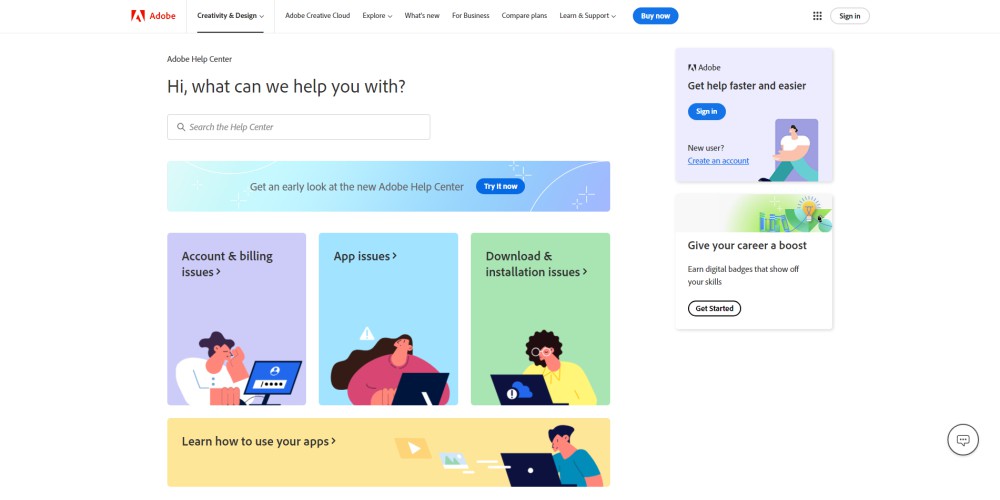
presents a visually appealing “Contact Us” page, distinguishing between contact options for sales, support, or billing with clear guidance on each.
A search function allows users to quickly find answers to frequent queries, and links are provided to further resources and community support tailored to the user’s software suite.

3. Shopify
boasts a streamlined and user-friendly “Contact Us” page, enabling users to easily search for answers or access primary services through designated buttons.
A virtual chat assistant, conveniently situated on the page’s right side, offers immediate support without the need for a separate chatbot interface.
Everything on the Shopify contact page is minimal and beautifully designed, making it one of our best contact us page examples.
4. Reddit
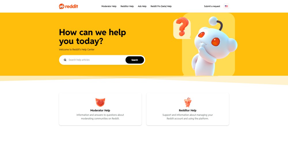
uses bold colors and a dual-section layout to guide users efficiently through its “Contact Us” page.
An option to submit a request is prominently placed in the page’s upper right corner, making it straightforward for users to seek assistance.
reddit’s Contact Us page is one of the best contact us page examples.
5. Beauty Counter
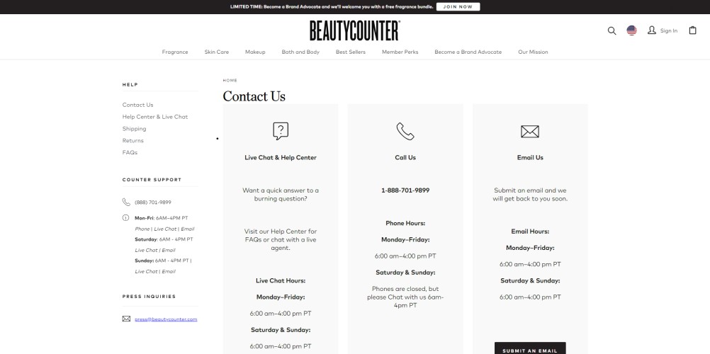
Exemplifies an effective ecommerce “Contact Us” page, with a side menu of useful links and main contact options presented in three subtly colored boxes.
The inclusion of operating hours for chat, calls, and email communication sets clear expectations for response times.
6. Canva
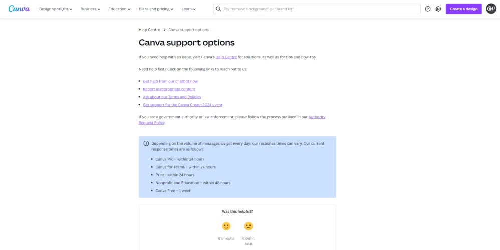
Canva keeps its “Contact Us” page simple yet informative, emphasizing key information such as response times by using a contrasting background color.
At the page’s bottom, a quick feedback option invites users to contribute to the enhancement of customer service.
7. Netflix
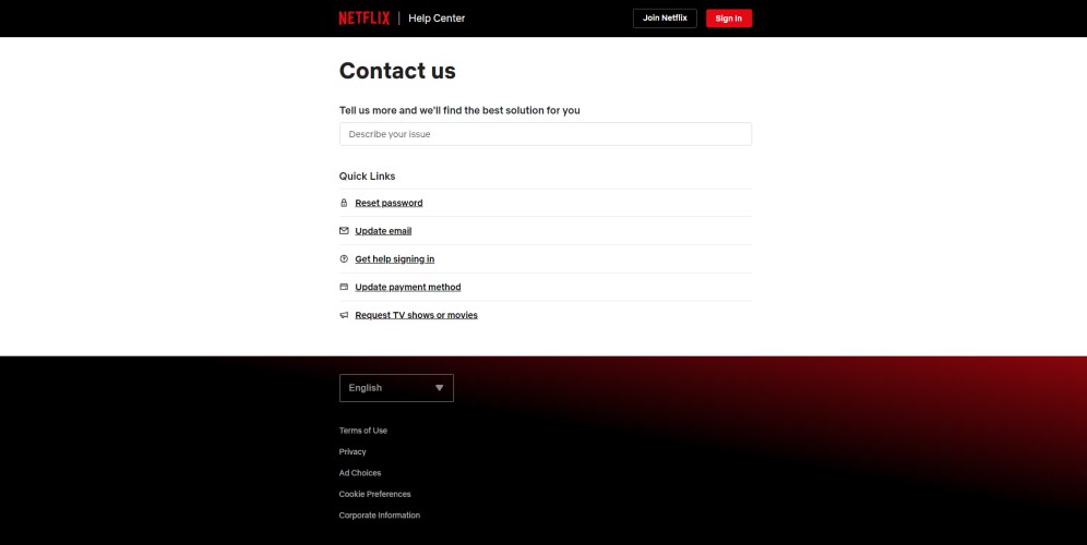
Excels in personalized customer service for its subscribers, greeting users by name and offering a suite of quick links for account management, including password resets and sign-in support. (Netflix Contact Us Page)
Additionally, a contact number for real-time assistance underscores Netflix’s commitment to customer care.
8. ClickUp
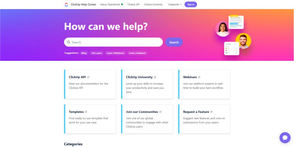
introduces its multi-faceted “Contact Us” page with a question, establishing a rapport with users.
The page provides a variety of contact methods and extensive categories for users seeking detailed information on features, covering all potential inquiries comprehensively.
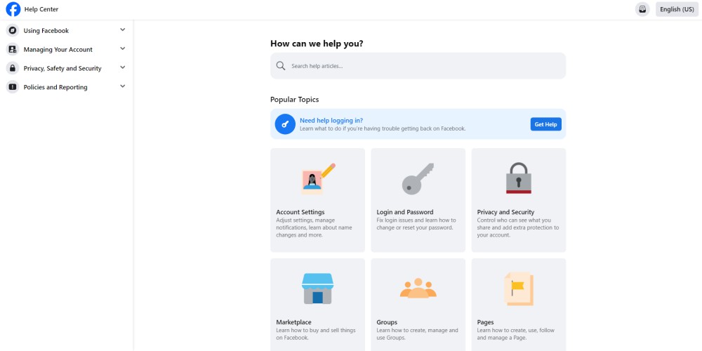
9. Facebook
Masterfully combines images with text on its “Contact Us” page, maintaining simplicity while effectively organizing resources for common consumer needs.
This approach facilitates easy access to essential information and support.

10. Walmart
Features a welcoming and easy-to-navigate “Contact Us” section, allowing users to quickly pinpoint solutions to their issues.
The page is further segmented into eight distinct sections, each offering quick links to additional support and information, ensuring a user-friendly experience for all customers.
Summary about Contact Us Page Examples

The contact us page examples highlighted in this article demonstrate the power of thoughtful design and strategic communication in enhancing customer experience.
They remind us that the “Contact Us” page is not just a destination for inquiries but a pivotal opportunity to engage, reassure, and connect with customers on a deeper level.
Whether through personalized service, intuitive navigation, or comprehensive support options, these Contact Us page examples serve as a blueprint for creating effective and memorable contact pages.
As businesses continue to evolve in the digital landscape, the lessons learned from these exemplary Contact Us pages will undoubtedly play a key role in shaping the future of customer interaction and satisfaction.
Order WordPress Website Design
At Maple Web Design, we specialize in creating stunning and functional WordPress websites that captivate audiences and drive results.
