
As more and more people use their mobile devices to access the internet, mobile optimization has become a crucial aspect of website design and search engine optimization (SEO).
Mobile optimization refers to ensuring that a website is optimized for mobile devices, such as smartphones and tablets.
This involves optimizing various elements of a website, such as its design, content, and functionality, to ensure that it is mobile-friendly.

The Importance of Mobile Optimization

What is Mobile Optimization for a Website?
Mobile optimization refers to tailoring a website to ensure it delivers an exceptional user experience on smartphones and other mobile devices.
In simpler terms, it’s about making your website user-friendly and functional on those smaller screens.
Today, smartphones reign supreme, and users expect flawless mobile experiences.
If your website isn’t optimized for mobile devices, you may miss out on a vast and engaged audience.

Responsive
Design
This is the process of designing a website to adapt to different screen sizes and devices.
A responsive website will adjust its layout and design to fit the screen of the device that it is being viewed on.

Mobile-friendly
Content
This refers to content that is optimized for mobile devices, such as shorter paragraphs, larger fonts, and smaller images.

Mobile-Friendly
Functionality
This involves optimizing a website’s functionality for mobile devices.
For example, ensuring that buttons are large enough to be easily clicked on a touch screen, and that menus are easy to navigate on a smaller screen.

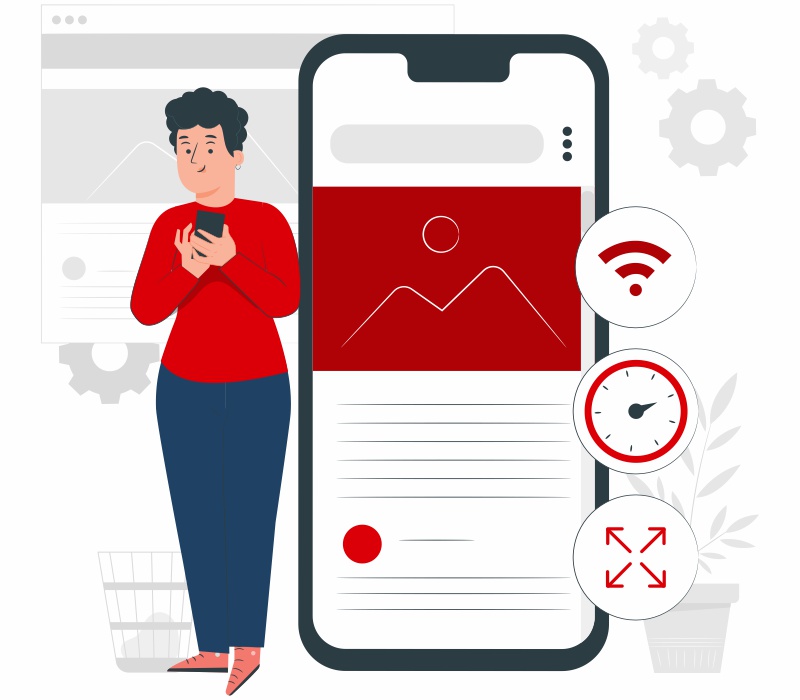
Page Load Speed
Mobile users are often on the go and may have limited internet connectivity.
This means that page load speed is an important factor in mobile optimization. Pages that load quickly on mobile devices are more likely to keep users engaged.

Font Size and Type
Mobile screens are smaller than desktop screens, so it is important to ensure that the font size and type are optimized for mobile devices.
Fonts that are too small or difficult to read can lead to a poor user experience.
Why is Mobile Optimization Crucial?
Consider these compelling statistics:
- Over 50% of all web traffic now originates from mobile devices (Statista, 2023).
- Google prioritizes mobile-friendly websites in search engine results pages (SERPs) (Search Engine Land, 2023).
- A slow-loading mobile website can significantly increase bounce rates (visitors leaving your site immediately) (Kissmetrics, 2023).
The Benefits of a Mobile-Optimized Website
Enhanced User Experience
A mobile-friendly website is easy to navigate, with clear calls to action and optimized content for smaller screens. This translates to happy and engaged visitors.
Increased Conversions
A seamless mobile experience paves the way for higher conversion rates, whether it’s a product purchase, a service inquiry, or a newsletter signup.
Improved Search Engine Ranking

Google prioritizes mobile-friendly websites, boosting your organic search visibility and driving more qualified traffic.
Brand Reputation
A mobile-optimized website reflects professionalism and attention to detail, fostering trust and enhancing your brand image.
How to Optimize the Website for Mobile?

Conduct a Mobile Audit
Analyze your website’s performance on mobile devices and identify any issues that need to be addressed.

Prioritize User Experience
Focus on creating a website that is user-friendly and easy to navigate on mobile devices.

Use Responsive Design
Make sure that your website is designed to be mobile-responsive, which means it adapts to any screen size.

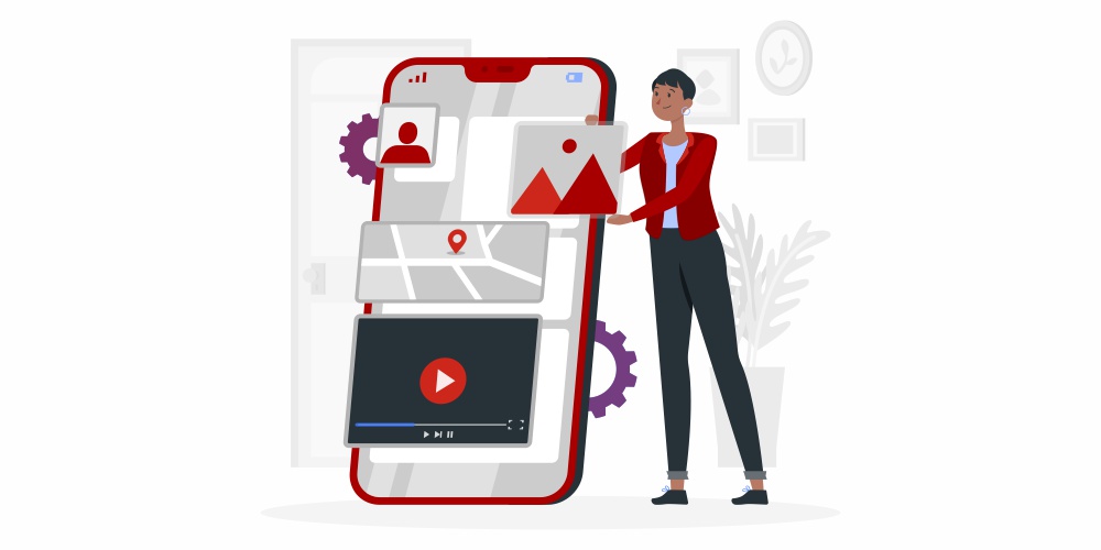
Optimize Images
Compress images to reduce their size and improve page loading times.

Minimize Code
Minify code to reduce file size and improve page loading times.

Implement Caching
Use caching to store frequently accessed data and speed up page loading times.

Test Your Website on Multiple Devices
Make sure your website is optimized for a variety of mobile devices and screen sizes.

Use Google's Mobile-Friendly Test
Use Google’s mobile-friendly test to determine how well your website performs on mobile devices.
Key Strategies for Mobile Optimization

Responsive Design
This ensures your website automatically adjusts its layout and content to fit any screen size, offering a perfect viewing experience on desktops, tablets, and smartphones.

Image Optimization
Large images can significantly slow down loading times on mobile devices.
We optimize images for mobile viewing, ensuring a fast and smooth experience.

Fast Loading Speeds
Optimizing code and compressing files is crucial for ensuring your website loads quickly on all devices.

Touch-Friendly Elements
Buttons, menus, and other interactive elements should be large and easy to tap with fingers, not designed solely for mouse clicks.

Prioritized Content
Not all content is created equal. Mobile optimization focuses on ensuring the most crucial information and calls to action are prioritized for easy access on smaller screens.
Frequently Asked Questions
Mobile app optimization (often abbreviated as ASO) focuses on improving the visibility and discoverability of your mobile app within app stores like Google Play Store and Apple App Store.
It involves optimizing app elements like title, description, keywords, and screenshots to rank higher in search results and attract more users.
While our expertise lies in website optimization, if you’re interested in mobile app optimization, we recommend consulting a mobile app development specialist.
Poor mobile optimization occurs when a website isn’t designed to function and display correctly on mobile devices.
- Slow loading times due to large images or unoptimized code.
- Text that’s too small to read on a mobile screen.
- Buttons and menus that are difficult to tap with fingers.
- Content that doesn’t adjust to the screen size, requiring horizontal scrolling.
- Unresponsive layouts that appear broken on mobile devices.
These issues create a frustrating user experience for mobile visitors, potentially leading to them abandoning your website.
There are several ways to optimize a website for mobile:
- Partner with a web design agency like Maple Web Design! We have the expertise to create a mobile-responsive website or revamp your existing website for optimal mobile functionality.
- Utilize website builders with built-in mobile responsiveness features.
- Explore WordPress themes specifically designed for mobile-friendliness.
Here are some ways to improve mobile usability:
- Test your website on different mobile devices: Use browser developer tools or mobile emulators to see how your website appears on various screen sizes.
- Focus on fast loading speeds: Optimize images, code, and files to ensure your website loads quickly on mobile devices.
- Simplify your navigation: Make it easy for users to find what they’re looking for with clear and concise menus.
- Use large, tappable buttons and links: Ensure interactive elements are finger-friendly.
- Increase font size for better readability: Text should be easy to read on smaller screens.
Scaling your website to mobile devices typically involves implementing a responsive web design approach.
This ensures the layout and content automatically adjust based on the screen size, offering an optimal viewing experience on desktops, tablets, and smartphones.
Converting your website to mobile-friendly can involve various approaches depending on your website’s current build.
- Redesign your website with a mobile-responsive framework: This is the ideal solution for a future-proof website that adapts to any device.
- Utilize a mobile plugin for existing website platforms: Some website platforms like WordPress offer plugins that can add a basic level of mobile responsiveness.
- Partner with a web developer: A web developer can assess your website and recommend the most suitable approach for mobile optimization.
Imagine a bakery website with a gorgeous photo gallery of pastries on a desktop. But on mobile? The text is too small, photos are crammed together. Not ideal!
Mobile optimization solves this. Images would shrink for faster loading, resize for the screen, and text would enlarge for easy reading.
Plus, a click-to-call button could appear for mobile users to easily order.
The rest of the text can remain unchanged.
Order WordPress Website Design
At Maple Web Design, we specialize in creating stunning and functional WordPress websites that captivate audiences and drive results.