
With the increase in the use of mobile devices, having a mobile-friendly website has become a necessity.
website that is not optimized for mobile devices can lead to a poor user experience and can harm the website’s ranking in search engines.
This is where responsive website design comes in.

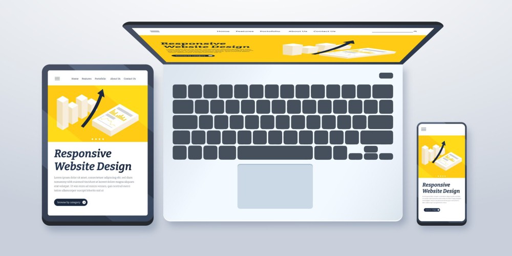
What is Responsive Website Design?

Responsive website design is a method of designing a website that adapts to the size of the screen it is being viewed on.
It ensures that the website looks good and functions well on any device, be it a desktop computer, a tablet, or a smartphone.
This is achieved by using flexible layouts, images, and CSS media queries that adjust the website’s design based on the device it is being viewed on.
Importance of Responsive Website Design


1. Improved User Experience
A responsive website design provides an optimal user experience across different devices.
The website adjusts its layout and design to fit the screen size of the device being used, making it easy for users to navigate and find what they are looking for.
A positive user experience leads to increased engagement, longer site visits, and a higher chance of conversion.

2. Better SEO
Google and other search engines prioritize mobile-friendly websites in their search results.
This means that a responsive website design can have a positive impact on a website’s ranking in search engine results pages (SERPs).
In addition, a mobile-friendly website improves the website’s load time, which is also a ranking factor for search engines.

3. Increased Conversion Rates
A responsive website design ensures that the website is easy to use and navigate, regardless of the device being used.
This leads to an increased chance of conversion, as users are more likely to stay on the website and complete a desired action, such as making a purchase or filling out a contact form.

4. Cost-Effective
Designing and developing a separate mobile website can be costly and time-consuming.
With a responsive website design, the website is optimized for all devices, reducing the need for separate mobile and desktop versions of the website.
Benefits of Responsive Website Design

1. Increased Mobile Traffic
A mobile-friendly website attracts more mobile traffic, as users are more likely to engage with a website that is easy to use on their mobile device.

2. Improved Brand Image
A website that is optimized for mobile devices shows that a business is up-to-date with the latest technology and cares about providing a positive user experience.
3. Competitive Advantage
A mobile-friendly website provides a competitive advantage over businesses that do not have a mobile-friendly website.
It can lead to increased engagement, better SEO, and higher conversion rates, all of which can help a business stand out from its competitors.
4. Flexibility
A responsive website design provides flexibility, as the website can be accessed on any device, at any time.
This allows businesses to reach a wider audience and cater to users who prefer to use their mobile devices to access the internet.
Ready to Elevate Your Online Presence with Expert SEO Services?
Contact Maple Web Design today to learn more about how our tailored SEO services & solutions can drive measurable results for your business.
Whether you’re looking to increase your website’s visibility, attract more organic traffic, or improve your search engine rankings, we have the expertise and experience to help you achieve your goals.