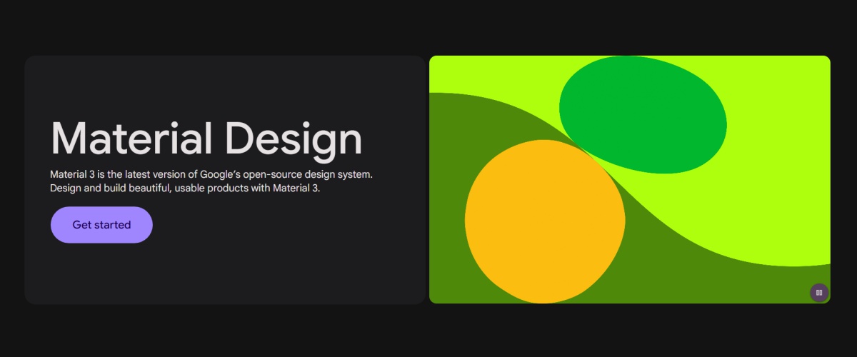
Google Material Design is a design language developed by Google to create a unified and engaging user experience across web and mobile applications.
Introduced in 2014, it focuses on creating intuitive, aesthetic, and responsive interfaces that emulate real-world interactions while leveraging digital innovations.
Material Design is built on the principles of motion, material, and bold graphics to deliver a consistent user experience. It provides a set of guidelines for colors, typography, animations, and layouts, making it easier for developers and designers to create cohesive and user-friendly applications.
Core Principles

- Material Metaphor: The foundational concept is that of “material,” envisioning UI elements as physical objects like sheets of paper, ink, and shadows. This creates a sense of depth and realism, making interactions feel more natural and intuitive.
- Motion: Smooth, purposeful animations and transitions guide the user’s attention, provide visual feedback, and enhance the overall experience. These motions are not mere decoration; they communicate the system’s state and reinforce the material metaphor.
- Grid-Based Layout: A strong emphasis on grids and consistent spacing establishes order and visual hierarchy, ensuring elements are arranged in a clear and predictable manner. This enhances readability and makes information easier to scan.
- Typography: Clear, legible typography is paramount. Material Design provides a robust type system with various styles and weights, ensuring optimal readability across different screen sizes and contexts.
- Color: A vibrant and expressive color palette is used to create visual interest, guide user attention, and convey meaning. The color system is carefully designed to be accessible and support brand expression.
Benefits of Google Material Design

- Consistency: Provides a unified visual language across different platforms and applications, creating a seamless and familiar user experience.
- Usability: Improves the overall usability by making interfaces more intuitive, predictable, and enjoyable to interact with.
- Efficiency: Streamlines the design and development process by providing a set of reusable components, guidelines, and tools. This reduces development time and ensures consistency across projects.
- Accessibility: Incorporates accessibility guidelines from the outset, ensuring that products are usable by people with disabilities.
- Innovation: Continuously evolves with new technologies and user needs, pushing the boundaries of what’s possible in digital design.
Examples of Google Material Design in Action
- Google Apps: Gmail, Google Drive, and Google Calendar showcase how Material Design creates a cohesive experience across products.
- Third-Party Apps: Many apps like Lyft and Pocket implement Material Design to enhance their interface and usability.
Adopting Google Material Design
For developers and designers looking to adopt Material Design, the Material Design website provides a wealth of resources, including:
- Design Guidelines: Comprehensive details on every aspect of Material Design.
- Tools: Resources like Material Theme Builder and Material Icons.
- Components: Pre-built Material Design components for frameworks like React and Angular.
Google Material Design 3

The latest iteration, Material Design 3, introduces several key enhancements:
- Dynamic Color: The system can generate a unique color palette based on the user’s wallpaper, creating a more personalized and expressive experience.
- Motion: More subtle and nuanced motion effects are incorporated, creating a more refined and engaging user experience.
- Updated Components: New and refined components offer greater flexibility and customization options, allowing developers to create more unique and tailored experiences.
Impact and Influence
Material Design has had a profound impact on the digital landscape. It has not only shaped the look and feel of countless Google products but has also influenced the design of many third-party applications across various platforms.
Its principles of clarity, consistency, and user-centricity have become cornerstones of modern UI/UX design.