

A customer can like your product and still leave without buying. Perhaps the size is unclear, delivery costs appear too late, or selecting a colour changes the photograph but leaves the price unchanged. Product page design is where those small uncertainties become business problems.
A product detail page, often shortened to PDP, should help someone understand the item, choose the right version, and buy with confidence. This guide explains how to build that experience for a real online store, including mobile layouts, product information, search visibility, and useful AI assistance.
Start with the buying decision
Before choosing a layout, list the questions customers ask before ordering and the reasons products get returned. A furniture store needs measurements and delivery details. A skincare shop needs ingredients and usage information. A software seller needs compatibility, licence terms, and renewal details.
Build the page around those questions. A beautiful template cannot compensate for missing information about whether a product will fit, work, or arrive in time.
If you are still choosing the underlying store software, use our guide to ecommerce platforms first. Here, the focus is the individual product page and the buying experience it supports.
Build a clear product page layout
Give shoppers a short route from understanding the product to choosing it. A practical starting layout is:
- Orientation: breadcrumbs, a descriptive product name, and a model or item reference where useful.
- Product gallery: an identifiable main photograph, followed by views that answer different questions.
- Purchase area: price, currency, availability, required options, quantity, and the primary purchase button.
- Order essentials: delivery information, pickup options where relevant, and a short returns summary.
- Supporting detail: benefits, specifications, fit or compatibility guidance, and care or installation instructions.
- Decision support: genuine reviews, product questions, and a small selection of relevant alternatives or accessories.
On desktop, a gallery beside the purchase area is a useful starting point. On mobile, check the actual reading order rather than assuming the desktop layout will collapse well. Shoppers should not have to scroll through a full brand story before finding the price.
Keep one clearly dominant action. “Add to cart” suits a standard retail purchase; “Request a quote” may suit a genuinely bespoke item. Multiple equally prominent buttons make the next step harder to understand.
Use product images that answer questions
Choose each image for a purpose: identify the product, show a detail, demonstrate use, or explain scale. Five useful photographs are preferable to ten near-identical angles.
Baymard’s product-page usability research highlights the value of showing products in scale and making variations easy to evaluate. For a bag, a photograph being worn helps explain size; for a chair, dimensions and a room view answer different questions.
Photograph what the customer will actually receive. If accessories are shown but sold separately, say so beside the image or in a clear caption. Provide usable zoom for details such as fabric, connectors, or finishes.
Use short, meaningful alternative text. “Oak dining table with extension leaf fitted” communicates more than “best furniture online.” Decorative images can use empty alt text. The W3C guidance on informative images explains how the image’s purpose and surrounding content should shape its text alternative.
AI can help prepare image backgrounds, but review the result against the real item. It must not invent included accessories, change the material, or make the product appear larger. Add video or interactive media when it explains something a still image cannot, such as assembly or movement.
Make price and product options unambiguous
The purchase area should describe the exact item being ordered. When someone chooses a different size, finish, or pack quantity, the displayed price, image, availability, and cart item must agree.
- Identify the currency. A Canadian store serving international visitors should make CAD pricing clear.
- Explain the unit. State whether the price is per item, pair, box, metre, or subscription period.
- Clarify recurring purchases. Show the billing interval and the terms customers need before choosing a subscription.
- Make options understandable. Label colour swatches with names and place fit guidance beside size selection.
- Show unavailable choices clearly. Explain whether an option is sold out, on backorder, or unavailable in that combination.
- Keep discounts honest. Avoid permanent countdowns, fabricated scarcity, and savings that do not reflect the actual offer.
If a required option is missing, identify it beside the relevant control. After adding an item, confirm the selected version and quantity. A button animation alone is not enough reassurance that the correct item reached the cart.
Write descriptions that help customers choose
Start with what the product is and who it suits. Then explain the features that matter to that customer, followed by the specifications needed to check the decision.
For a hypothetical folding desk, “A compact desk that folds away between work sessions” is more useful than “Transform your workspace with premium innovation.” The next details should cover open and folded dimensions, materials, supported load, assembly, and what is included. Verify each specification before publishing it.
Match the supporting information to the product:
- Clothing: garment measurements, fit notes, fabric composition, and care instructions.
- Furniture: dimensions, materials, assembly requirements, and delivery access considerations.
- Electronics: compatible devices, ports, power requirements, and included accessories.
- Digital products: file formats, software requirements, permitted use, and delivery method.
- Custom products: personalization limits, proof approval, production time, and applicable return exclusions.
Keep essential details visible or in clearly labelled expandable sections. Do not make customers download a PDF just to discover a basic measurement. Technical documents can provide additional detail.
Manufacturer specifications can be necessary, but surround them with your own useful guidance. Explain compatibility, answer recurring questions, and identify who should choose a different model. That is more valuable than rewriting the same generic description with synonyms.
For downloadable goods, our guide to digital products to sell shows how to define file contents, usage rights, and the support included in an offer.
Put delivery and returns beside the buying decision
“Shipping calculated at checkout” may describe the checkout process accurately, but it leaves a shopper with an unresolved cost. Where possible, offer a postal-code estimate or explain the shipping rate and any free-shipping conditions near the purchase area.
Separate dispatch time from transit time. A made-to-order item that takes two weeks to produce should not appear to arrive in three days because only the carrier’s transit estimate is shown.
For Canadian customers, clarify regional delivery limits, pickup locations, and remote-area surcharges where they apply. If the total depends on destination or selected options, explain what will be calculated before payment.
Give returns a short, readable summary with a link to the full policy. Cover the return window, condition requirements, who pays return shipping, and relevant exclusions. Avoid a blanket “easy returns” promise on a product that is final sale.
Use trust signals customers can verify
Product reviews should belong to the product being viewed. A company’s Google rating is not a substitute for product-specific feedback, and imported reviews should retain appropriate attribution and context.
Make reviews useful to scan. A size-related comment, a customer photograph, or an explanation of how the item performed can answer a buying question that a star average cannot. Respond constructively when feedback reveals a recurring misunderstanding.
For a new product without reviews, use accurate specifications, clear policies, identifiable business details, and a working contact route. Do not fill the gap with invented testimonials or unsupported “verified” badges.
Keep accessories relevant and explain compatibility. A recommended charger should actually fit the device on the page. Additional products should help complete the purchase, without interrupting the customer before they have chosen the main item.
Design the mobile purchase flow deliberately
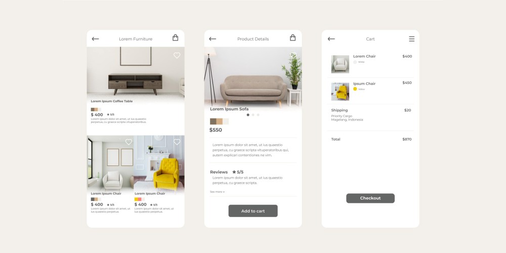
Test the page with one hand on a real phone. Open the gallery, select an option, read delivery information, add the item, and check the cart. Look for awkward steps that are easy to miss on a desktop preview.
A sticky purchase bar can help on a long page, but it should reflect the selected product and price. It must not cover size controls, error messages, cookie choices, or the chat widget. If important options remain unselected, bring the customer to those options.
Use readable text and controls with enough space to operate comfortably. Give form fields visible labels, preserve a visible keyboard focus, and communicate selected or unavailable states with more than colour alone. Make sure closing the gallery returns the customer to a sensible place.
Keep the main image efficient, reserve image dimensions to prevent shifting content, and avoid loading every video immediately. Test a representative page with your actual reviews, analytics, and chat tools installed. Our guide to website speed testing tools helps you investigate slow pages beyond a theme’s demo score.
Make product pages useful for search
Give each distinct product a descriptive title, a clear main heading, and information specific to that item. Use the terms customers need to identify it, including the model, material, or intended use when relevant.
Keep the page’s purpose clear. Category pages help people browse a range; product pages help them evaluate and buy a particular item; buying guides help them choose between approaches. Link these pages where they help the reader rather than repeating the same broad keyword target across all three.
Do not create near-identical pages for every search phrase. Product options also need a deliberate URL strategy. A variant that deserves its own landing page should have a stable address and meaningful distinguishing information; other options may work within the same product page.
Keep structured product data accurate
Use your platform’s supported integration to describe the product and its offer, including the actual price, currency, and availability. Check that theme and app integrations do not output conflicting information. Google’s merchant listing documentation covers supported product, shipping, and return details. Validate eligible pages with the Rich Results Test; correct markup does not guarantee an enhanced search appearance.
For related variants, Google also documents ProductGroup and product variant markup. The implementation should match how your store represents those options. Keep visible content, structured data, and any Merchant Center feed consistent when stock or prices change.
Plan for unavailable products
For a temporary stock shortage, keep the page useful: show the current status, remove misleading purchase promises, and offer a genuine restock notification or suitable alternatives.
For a permanently retired product, decide whether the page still helps existing owners. Manuals and compatibility information can justify retaining it. If a substantially equivalent replacement exists, consider a permanent redirect. Avoid sending every discontinued item to the homepage, where the original request is left unanswered.
Use AI assistance for questions the page cannot anticipate
A shopper may ask which accessory fits their existing purchase or where to find a different model. Chat can help with these individual questions. Keep essential specifications, prices, and policies on the page so buying does not require a conversation.
For WooCommerce stores, MWD AI Assistant with the WooCommerce add-on can show product cards with names, images, current prices, stock information, and links to native product pages. Eligible simple-product cart actions are optional; product options and payment remain in the normal WooCommerce flow.
The single-site Pro licence is US$79 per year, and the separate WooCommerce add-on is US$69 per year: US$148 annually before applicable taxes and separately billed AI-provider usage. These published prices were checked on September 13, 2026.
Test questions the assistant cannot answer confidently, including uncertain compatibility and delivery exceptions. Give it an appropriate route to your team. Our guide to live chat and AI assistants for websites explains how to choose the wider support workflow.
Check the template before applying it to the whole catalogue
Start with a small set of representative products: a simple item, a product with several options, an unavailable item, and your most complicated purchase. Run each through the same checks:
- Can a new customer identify the product and what is included?
- Do selected options match the photograph, price, stock status, and cart?
- Are delivery costs, timing, and relevant return restrictions easy to find?
- Can someone complete the flow on mobile and with a keyboard?
- Does the cart confirm the correct item without unexpected extras?
- Do product information and structured data agree?
After changes, assess purchases alongside add-to-cart activity, support questions, and returns. More cart additions are not a complete success if customers abandon checkout or receive the wrong version. Low-traffic stores can learn from observed shopping sessions and recurring support questions without treating a handful of orders as a reliable A/B test.
Frequently asked questions
Long enough to answer the buying questions for that product. A replacement cable may need a short description and precise compatibility details. An expensive machine may need extensive specifications, installation guidance, and documents. Organize for scanning rather than aiming for a word count.
Use a consistent base, with optional sections for different product types. A sizing guide belongs on apparel; a licence explanation belongs on software. Requiring every item to fill every section creates irrelevant content and extra maintenance.
Either can support a strong product page. The practical choice depends on your catalogue, integrations, customization requirements, and who maintains the store. See our Shopify vs WooCommerce comparison for Canadian businesses for that platform decision.
Build the product page around the store you operate
A useful product page makes the details, interface, and fulfilment promise agree. Start by removing the uncertainties that stop customers choosing the right item, then refine the presentation.
Maple Web Design’s ecommerce website design services include product and category pages, cart and checkout, and payment and shipping setup. Published starter-store pricing begins at C$3,300 for up to 25 products. That is a store-build starting price, not a quote for an individual product page.
For an existing store, send us your store URL and a representative product. Include the options customers choose and the questions your team keeps answering, so the project can be scoped around the actual buying process.